Seaborn is a high level visualisation tool built on top of matplotlib which enables us to work with dataframes easily. We will try to make use of this Automobile dataset and try to gain some information with the help of seaborn plots. This post will be an exploratory one.
| |
The following plots are made similar to this post but with a different dataset.
The plotting will be divided into two sections,
- Visualizing statistical relationships
- Plotting categorical data
Let’s find import the dataset
| |
| symboling | normalized_losses | make | fuel_type | aspiration | number_of_doors | body_style | drive_wheels | engine_location | wheel_base | ... | engine_size | fuel_system | bore | stroke | compression_ratio | horsepower | peak_rpm | city_mpg | highway_mpg | price | |
|---|---|---|---|---|---|---|---|---|---|---|---|---|---|---|---|---|---|---|---|---|---|
| 0 | 3 | 168 | alfa-romero | gas | std | two | convertible | rwd | front | 88.6 | ... | 130 | mpfi | 3.47 | 2.68 | 9.0 | 111 | 5000 | 21 | 27 | 13495 |
| 1 | 3 | 168 | alfa-romero | gas | std | two | convertible | rwd | front | 88.6 | ... | 130 | mpfi | 3.47 | 2.68 | 9.0 | 111 | 5000 | 21 | 27 | 16500 |
| 2 | 1 | 168 | alfa-romero | gas | std | two | hatchback | rwd | front | 94.5 | ... | 152 | mpfi | 2.68 | 3.47 | 9.0 | 154 | 5000 | 19 | 26 | 16500 |
| 3 | 2 | 164 | audi | gas | std | four | sedan | fwd | front | 99.8 | ... | 109 | mpfi | 3.19 | 3.40 | 10.0 | 102 | 5500 | 24 | 30 | 13950 |
| 4 | 2 | 164 | audi | gas | std | four | sedan | 4wd | front | 99.4 | ... | 136 | mpfi | 3.19 | 3.40 | 8.0 | 115 | 5500 | 18 | 22 | 17450 |
5 rows × 26 columns
It can be observed that the dataset has almost equal share of categorical and numerical dataset. We can check that as,
| |
symboling                int64
normalized_losses        int64
make                    object
fuel_type               object
aspiration              object
number_of_doors         object
body_style              object
drive_wheels            object
engine_location         object
wheel_base             float64
length                 float64
width                  float64
height                 float64
curb_weight              int64
engine_type             object
number_of_cylinders     object
engine_size              int64
fuel_system             object
bore                   float64
stroke                 float64
compression_ratio      float64
horsepower               int64
peak_rpm                 int64
city_mpg                 int64
highway_mpg              int64
price                    int64
dtype: object
With the above information as the basis, let’s start exploring the relationships within data.
Visualizing statistical relationships
Statistical relationships are drawn between numerical data with the aim of understanding how one variable affects other, if at all.
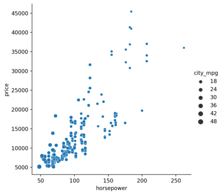
Scatter plot is drawn using relplot() function of seaborn. Let’s start with the obvious ones, checking whether the horsepower and price are related.
| |
<seaborn.axisgrid.FacetGrid at 0x1ded91a5370>
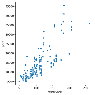
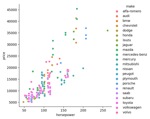
Based on the above plot, one can expect a positive correlation between the horsepower and price. But, can there be any other factor that affect the price, say the make?
| |
<seaborn.axisgrid.FacetGrid at 0x1ded91a5400>
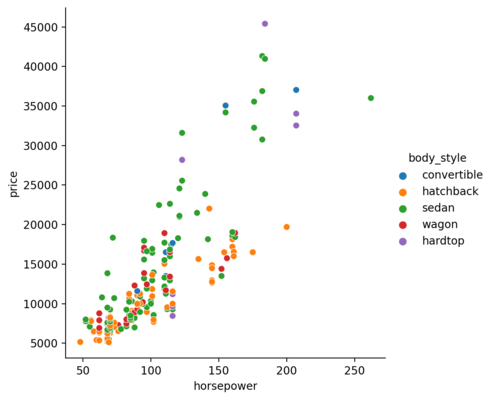
or the body style?
| |
<seaborn.axisgrid.FacetGrid at 0x1dedbb75b50>
So far, we have given the categorical data for the hue parameter. But, numerical data can also be used.
| |
<seaborn.axisgrid.FacetGrid at 0x1dedbd2f550>
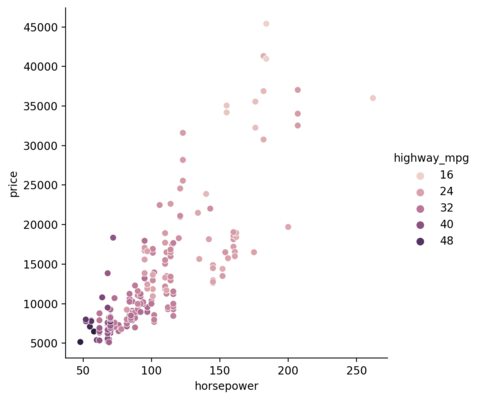
The cheaper ones seem to churn out higher mpg than the counterpart. We can also check that with the help of size parameter.
| |
<seaborn.axisgrid.FacetGrid at 0x1dedbb9bdc0>
Visualizing categorical data
In order to visualize the categorical data, we will use the catplot() function from the seaborn library.
Jitter Plot
Initially, we will draw the relationship between the body style(categorical data) and curb weight(numerical data).
| |
<seaborn.axisgrid.FacetGrid at 0x1dedbdc7d60>
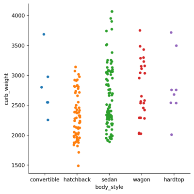
The above plot is, similar to the title, jittered. They can be lined up by changing the jitter parameter.
| |
<seaborn.axisgrid.FacetGrid at 0x1dedbf00370>
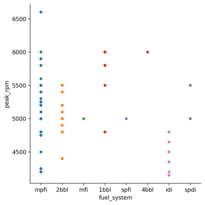
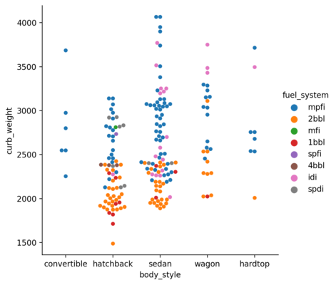
Hue Plot
Similar to the relplot(), we can add another dimension to the picture with the hue parameter.
| |
<seaborn.axisgrid.FacetGrid at 0x1dedbde0d90>
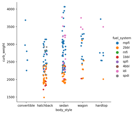
Swarm Plot
The above plot has overlaps which can be eliminated by setting the parameter kind to swarm. This uses an algorithm which organizes the points intelligently and eliminates the overlap.
| |
<seaborn.axisgrid.FacetGrid at 0x1dedbe9caf0>
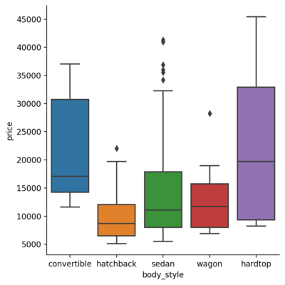
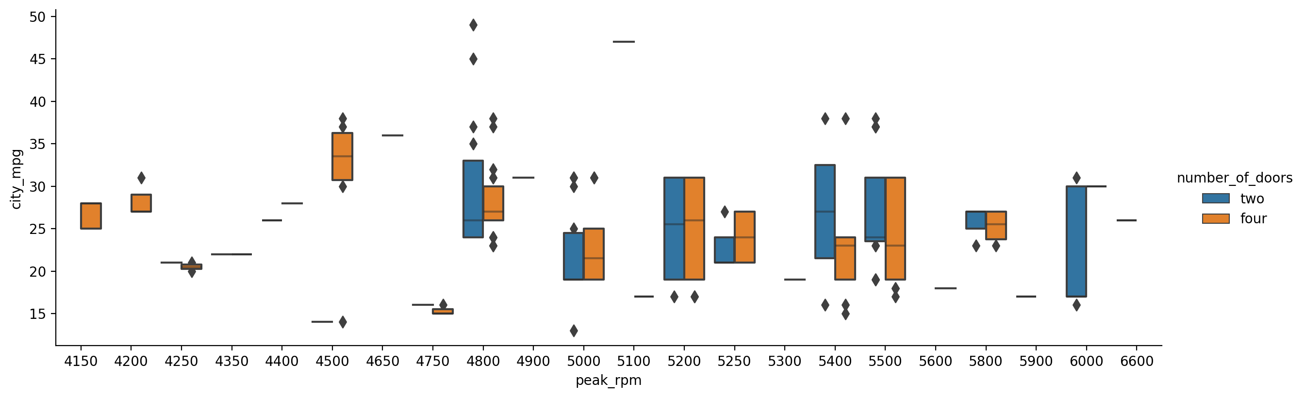
Box Plot
Box plot shows the quartile values, extremas and the outliers for each category with respect to some numerical relation. This is obtained by setting the kind parameter to box.
| |
<seaborn.axisgrid.FacetGrid at 0x1dedbcce400>
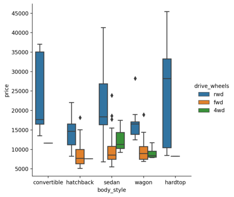
We can also include the hue parameter to it.
| |
<seaborn.axisgrid.FacetGrid at 0x1dedc839b20>
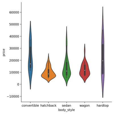
Violin Plot
Violin plot is a richer version of the boxplot as it includes the aforementioned data and enriches it with the kernel density information.
| |
<seaborn.axisgrid.FacetGrid at 0x1dedd22c5b0>
In addition to that, if the hue is added for a binary categorical data and enable the split parameter, we get the plot as follows:
| |
<seaborn.axisgrid.FacetGrid at 0x1dedbe6aac0>

Bar Plot
| |
<seaborn.axisgrid.FacetGrid at 0x1dedc7a63a0>
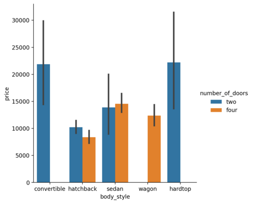
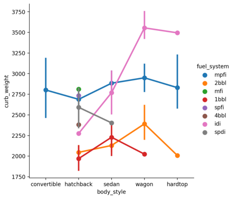
Point Plot
Point plot shows the estimated value and confidence interval for each hue. The vertical line shows the confidence interval for each category.
| |
<seaborn.axisgrid.FacetGrid at 0x1dedbb8bbe0>
Visualizing Distribution of dataset
Plotting Univariate Distribution
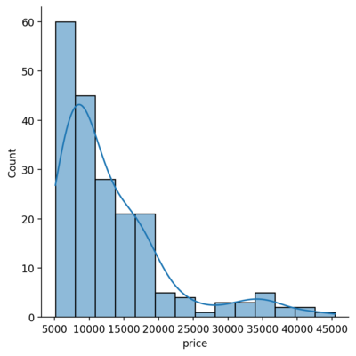
Histograms
In seaborn, the displot() function plots the histogram fro the specified series in the dataset. By default, it hides the kernel density estimate for the data which can be turned on by setting the parameter kde to True. The function histplot() has the similar functionality.
| |
<seaborn.axisgrid.FacetGrid at 0x1dedfe1f5b0>
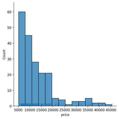
Rug plot
Another representation will be the rugplot which draws a stick at every observation.
| |
<seaborn.axisgrid.FacetGrid at 0x1dedbd3f280>
Plotting Bivariate Distribution
Bivariate distributions show how two variables vary with respect to each other. This can be plotted using the jointplot() function.
| |
<seaborn.axisgrid.JointGrid at 0x1dedfe28b80>
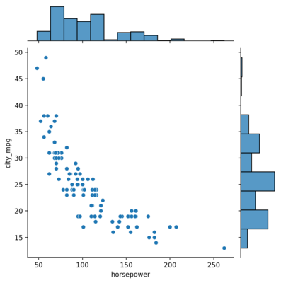
There’s a clear negative correlation between the two as one may expect.
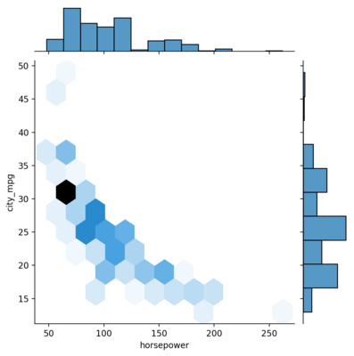
Hex Plot
Hex plot is another way to visualize where the data are put in hexagonal bins for each pair of the bars on the edges.
| |
<seaborn.axisgrid.JointGrid at 0x1dedf354b50>
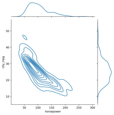
KDE Plot
This can be plotted by setting the kind to kde.
| |
<seaborn.axisgrid.JointGrid at 0x1dedf44f640>
Heatmaps
Heatmaps can be used to get the general correlation between the variables.
| |
<AxesSubplot:>

Boxen Plots
Boxen plots are similar to box plots but can also be used to infer the bivariate relations as gives insight for the shape of the distributions.
| |
<seaborn.axisgrid.FacetGrid at 0x1dedd215790>
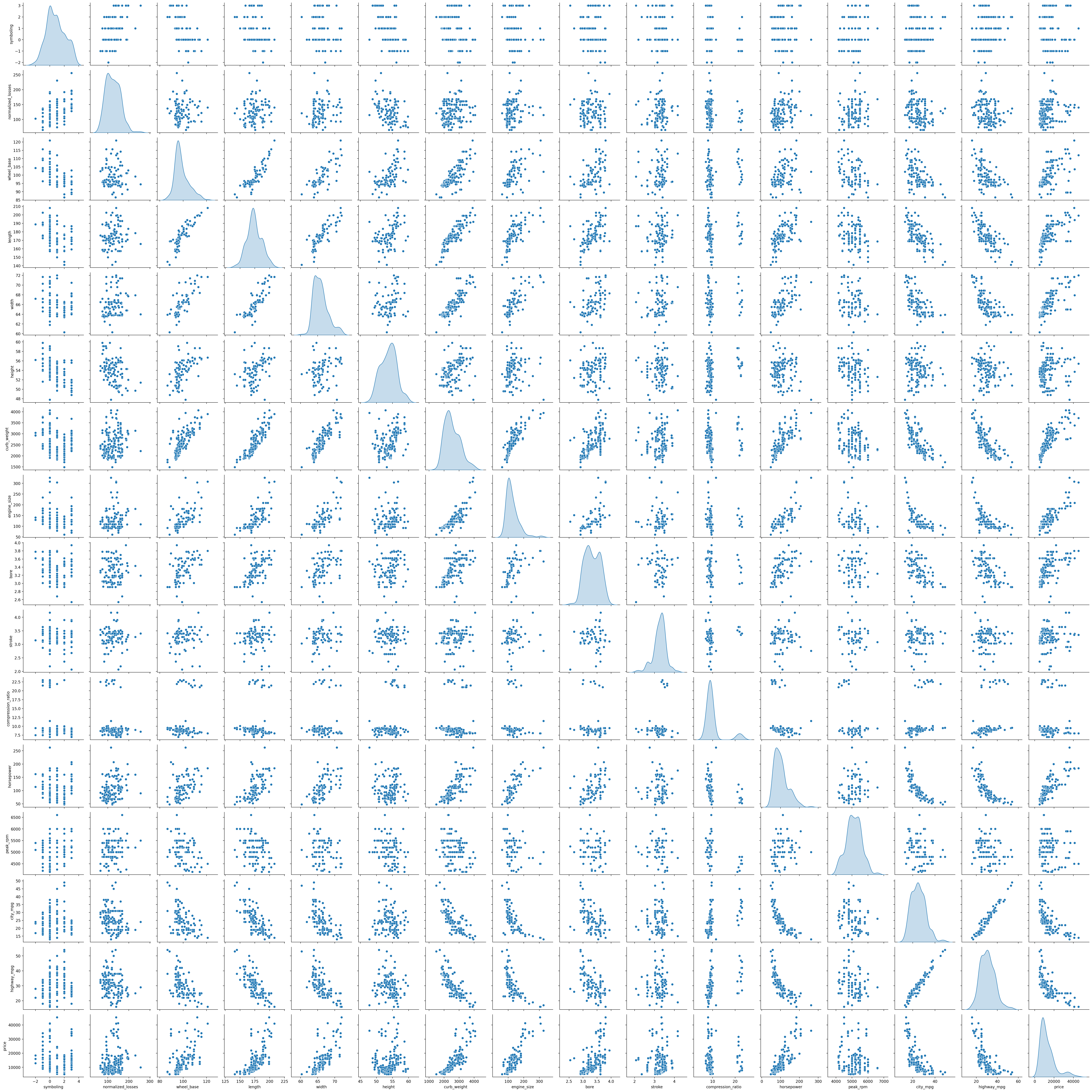
Visualizing Pairwise Relationships
Finally, we take a look at generating the pairwise plot between all the variables in the dataset. This is achieved with the help of the pairplot() function. This also plots the univariate data along the diagonal of the plot which can be replaced with the KDE by passing the corresponding value to diag_kind parameter.
| |
<seaborn.axisgrid.PairGrid at 0x1dedc75b4c0>
The above plots have given me a good introduction to the seaborn library. I indent to proceed further with visualizing and exploring data with python and the related libraries for a while and seaborn seems to provide the same kind of easiness as Julia plots. This feels like a good starting point!